Tandem Community
Designing a mental health platform that actually feels like it was made for you.
Tandem Community is a maternal mental health platform built specifically for women of color - a population that experiences perinatal anxiety and depression at significant rates and is routinely underserved by tools that weren't designed with them in mind. I designed the patient-facing experience, the provider dashboard, and the design system. The hardest part wasn't the clinical complexity. It was making the product feel warm, human, and genuinely representative without flattening the diversity of the women it serves into a aesthetic gesture.
The Problem
Clinical tools default to clinical. That's exactly the problem.
Mental health products tend to look like mental health products - sterile, cautious, built to signal seriousness rather than to invite trust. For women of color navigating perinatal mental health, a population that already faces systemic barriers to care and has real reasons to distrust clinical systems, that's not a friction point. It's a wall. Tandem's value proposition is that it was built for them, and the design had to make that legible immediately - not just in the mission statement, but in every visual and tonal decision. The question wasn't "is this usable?" It was "does this feel like it belongs to the women using it?"
The Pivotal Choice
Warmth as a design requirement, not a nice-to-have.
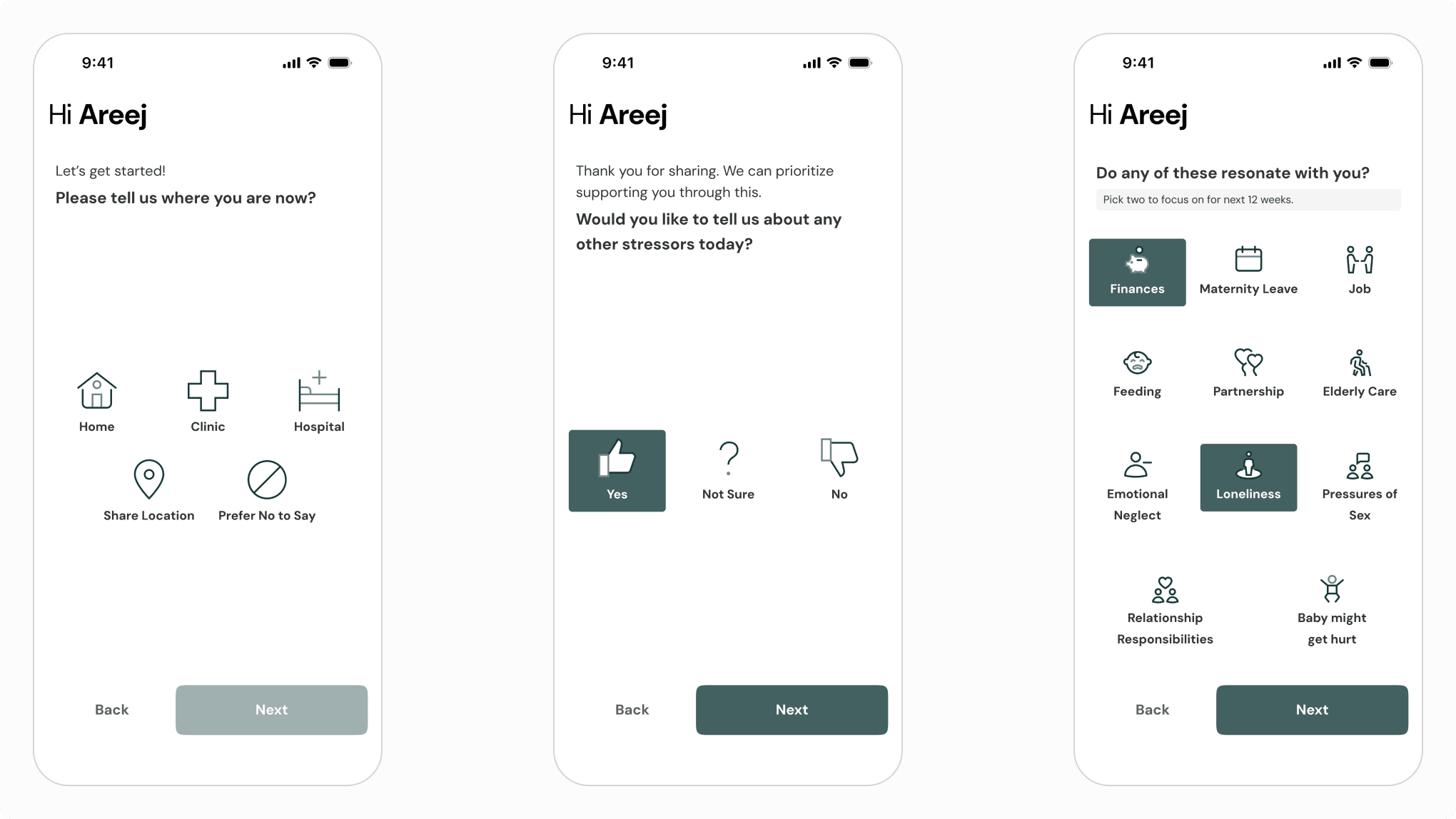
The decision that shaped the patient experience most was treating warmth as a functional requirement - in a product where trust is a prerequisite for engagement and the subject matter is personal and often stigmatized, a cold interface isn't just unwelcoming, it's a reason to disengage. That meant rethinking every default: typography that feels conversational rather than institutional, color with emotional resonance that doesn't veer into generic wellness pastels, and visual language that reflects the actual diversity of the women using it through specificity of detail rather than tokenism. The cultural dimension required being intentional about what "warm" means across different contexts, and resisting the shortcut of a single aesthetic that stands in for diversity without achieving it.
The Design
Two users, one coherent product.
The patient experience and the provider dashboard have fundamentally different jobs and different emotional registers - one needed to feel personal and human, the other efficient and clinical. Keeping both sides feeling like the same product is where the design system did its most important work: shared foundations in type, color tokens, and spacing, with components calibrated to context. The same underlying language, expressed differently depending on who's in the room.
SELECTED WORK
Patient Mobile App
SELECTED WORK
Early Product
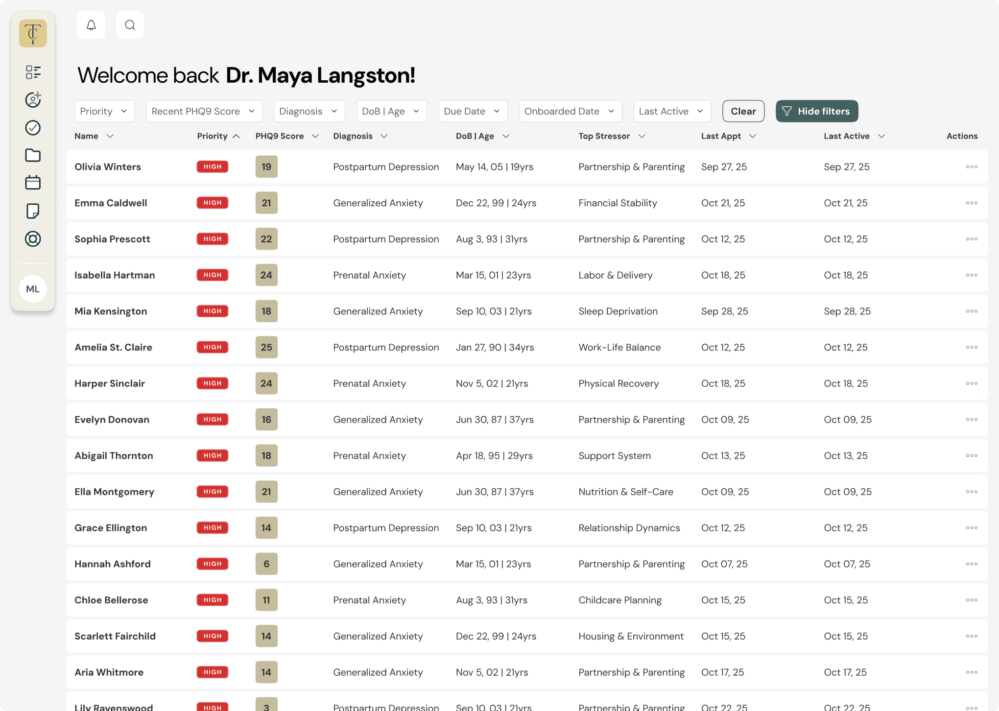
Every patient, visible at a glance. Designed so care teams can prioritize quickly without losing sight of the person behind the row.
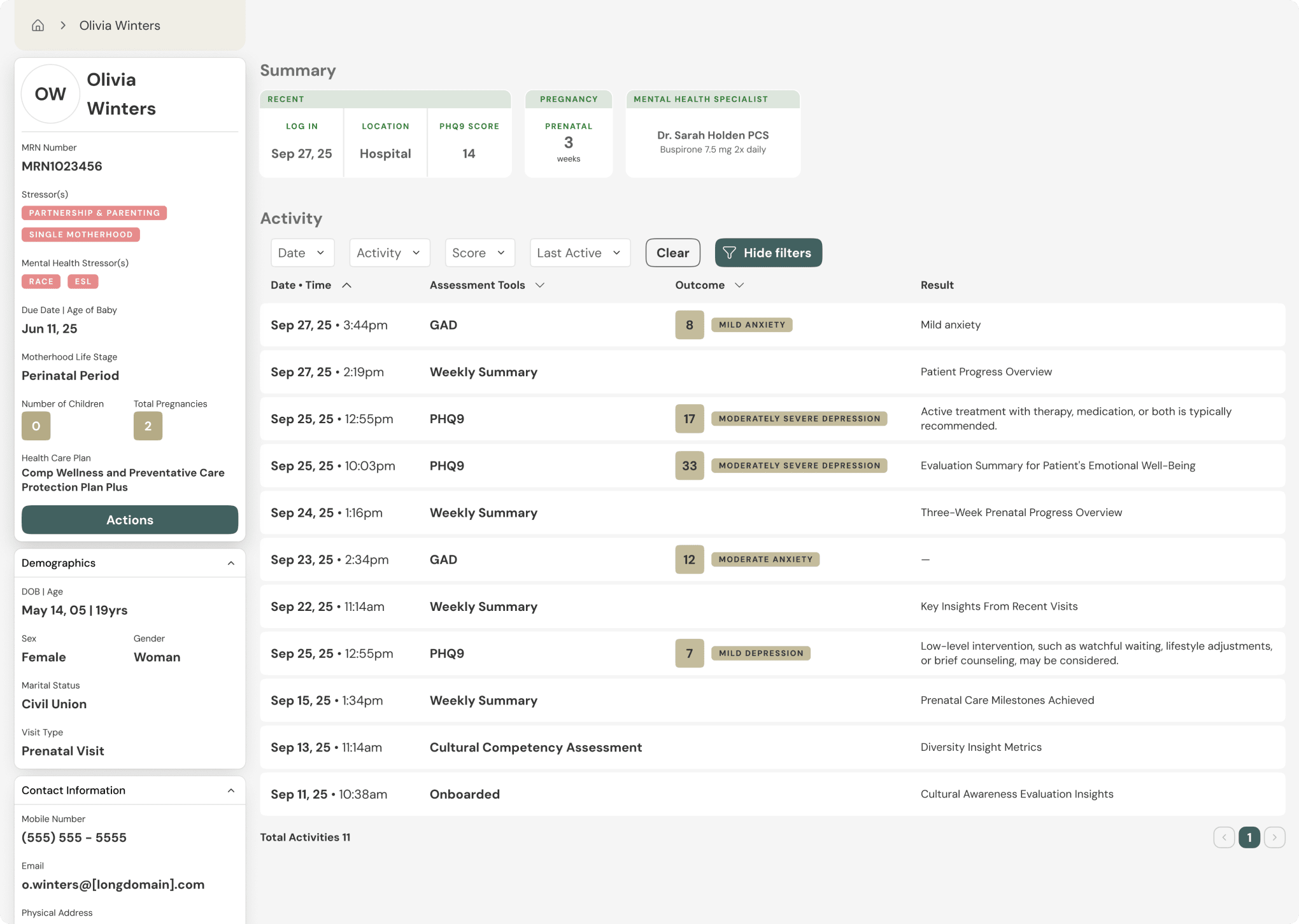
The full picture of a patient's journey, history, check-ins, and context, in one place. Clinical clarity that doesn't feel clinical.


The right message, to the right patient, at the right time. AI handles the coordination.
The Takeaway
What this project taught me about representation in design.
Designing for a specific cultural audience isn't a constraint on good design - it's a clarifying force. It removes the option of defaulting to generic and replaces it with a requirement to be deliberate. Every visual decision on Tandem had to be justifiable not just aesthetically, but in terms of who it was made for and whether it would actually land for them. That's a higher bar, and a more honest way to work.